
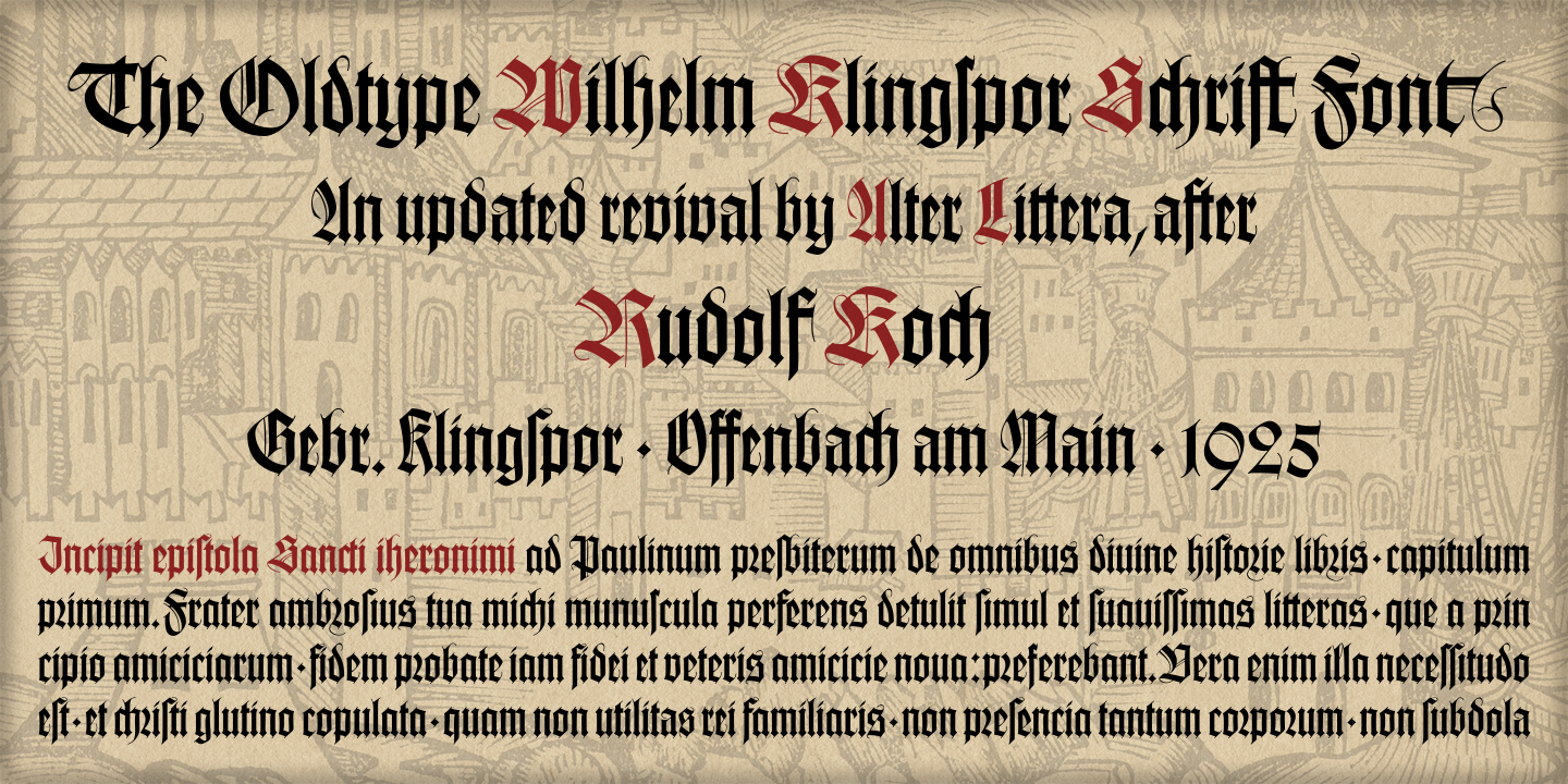
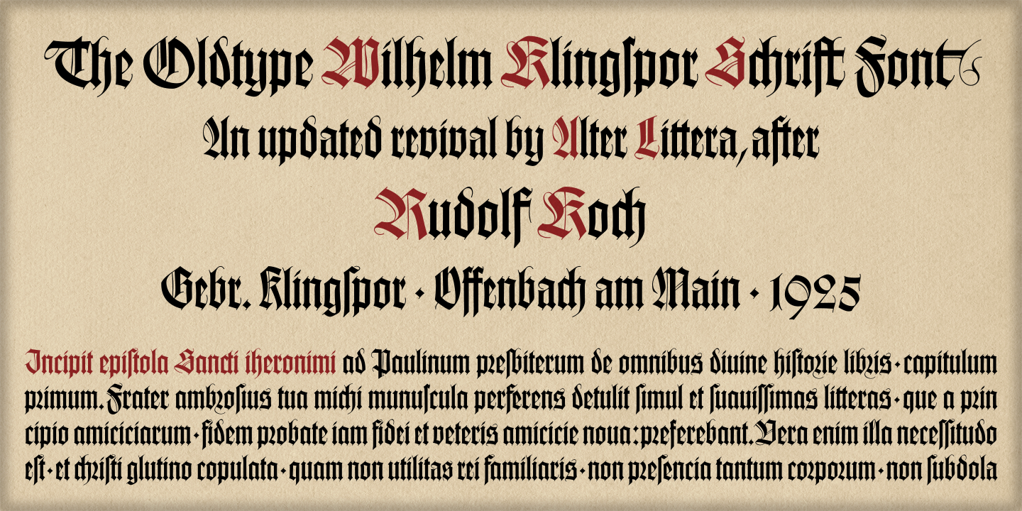
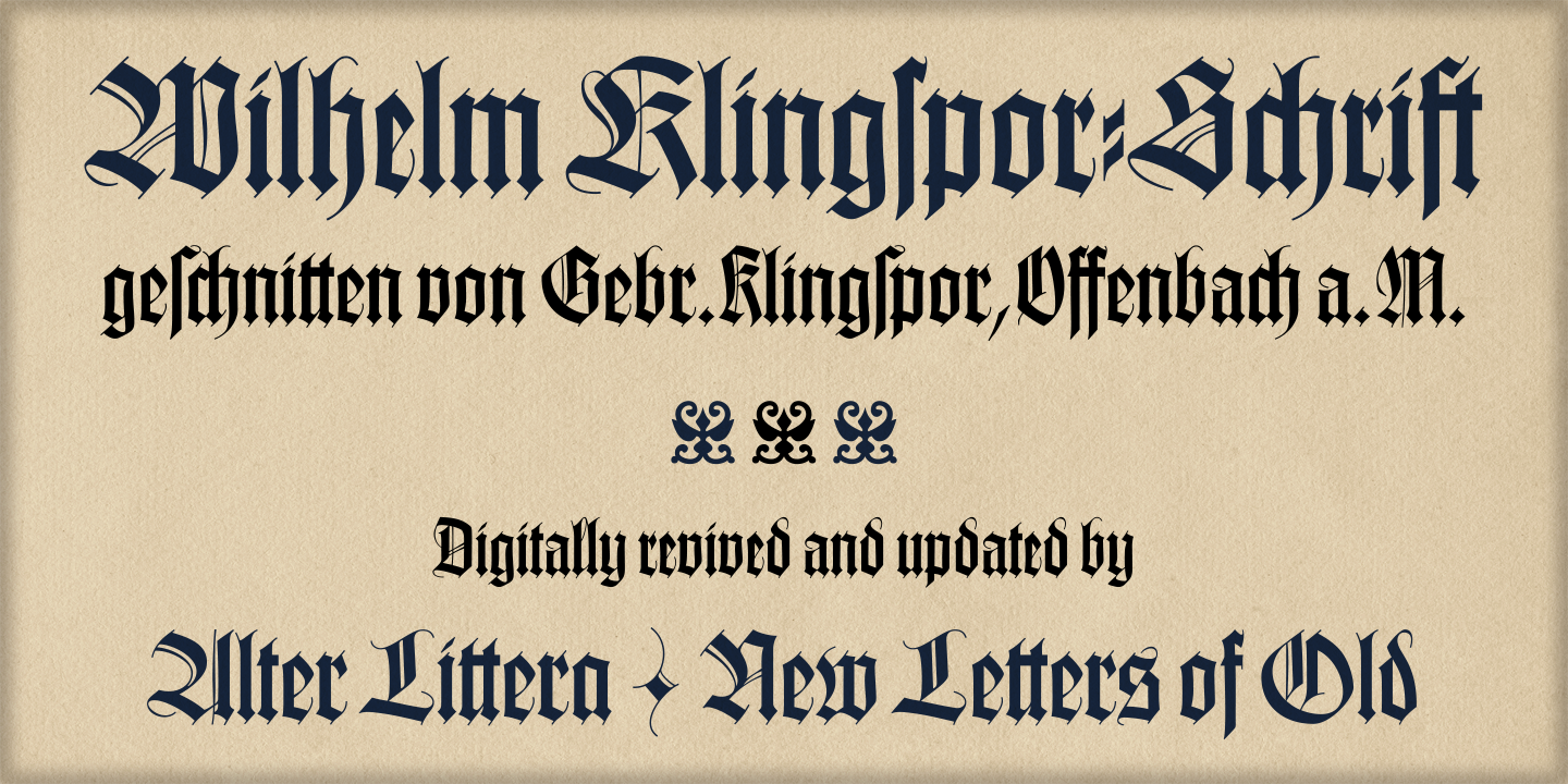
The Oldtype "Wilhelm Klingspor Schrift" Font
Current Version: ALOT WKlingspor Schrift 1.0 (Initial Release - May 2013)
[ Specimen ] - [ Character Map and Opentype Features ] - [ License ] - [ Order ]
Basic Commercial Licenses available at MyFonts
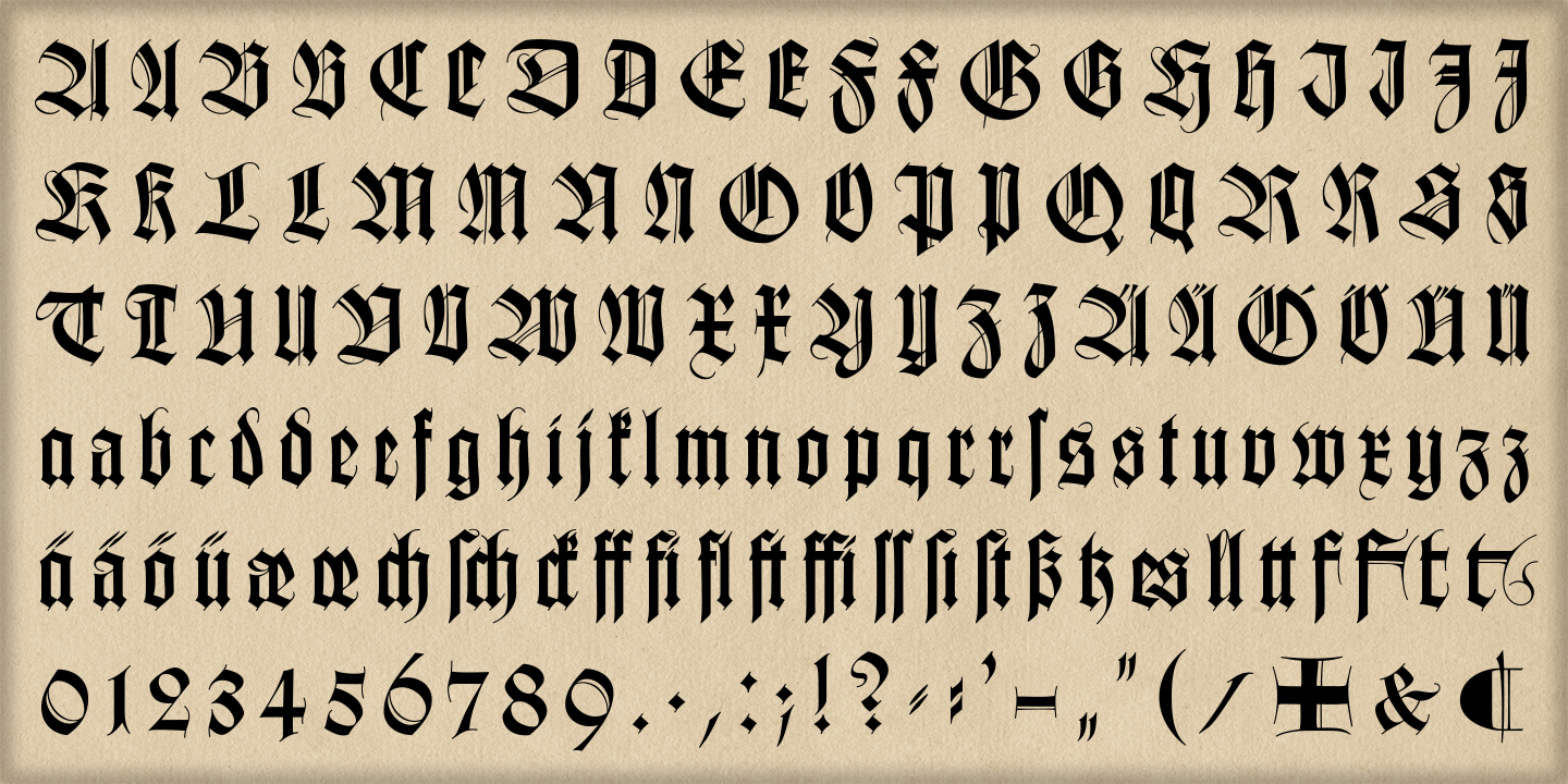
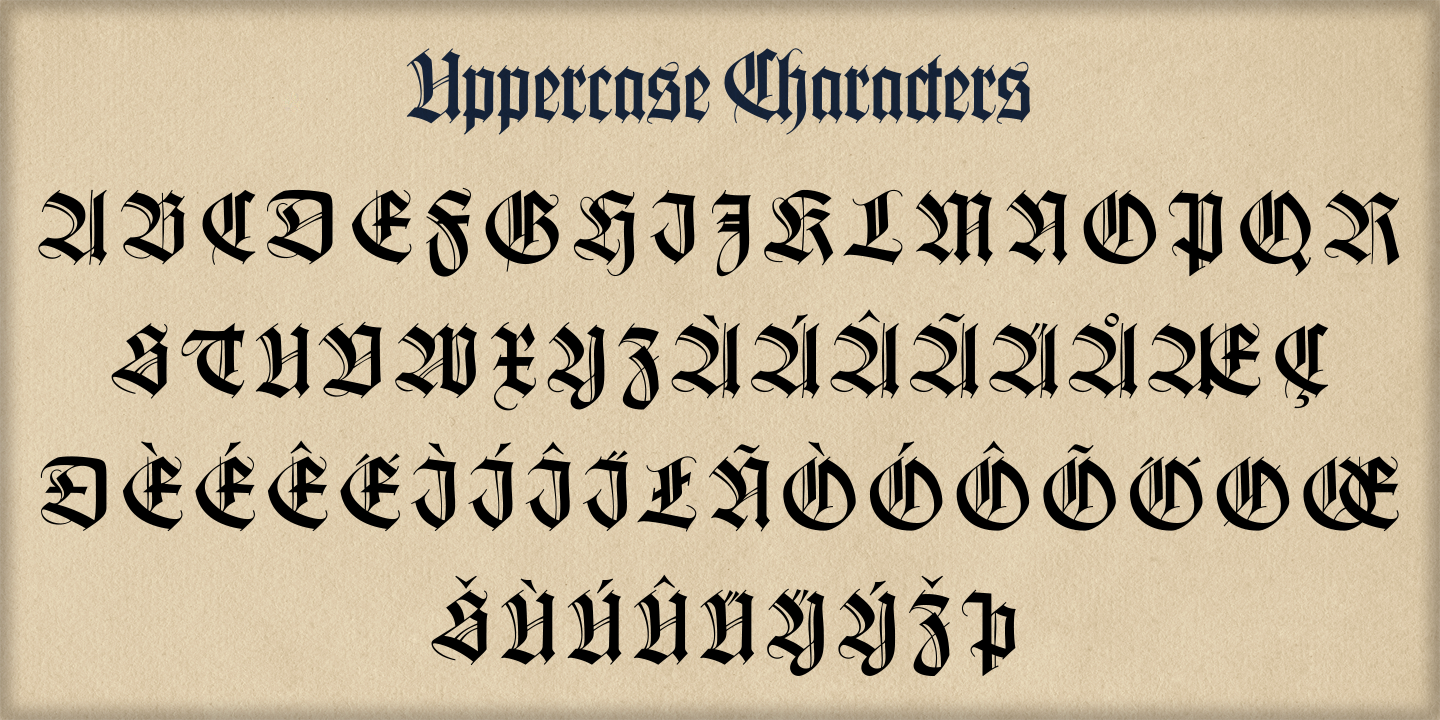
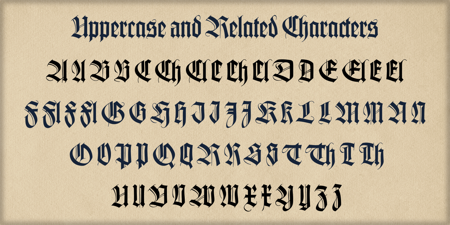
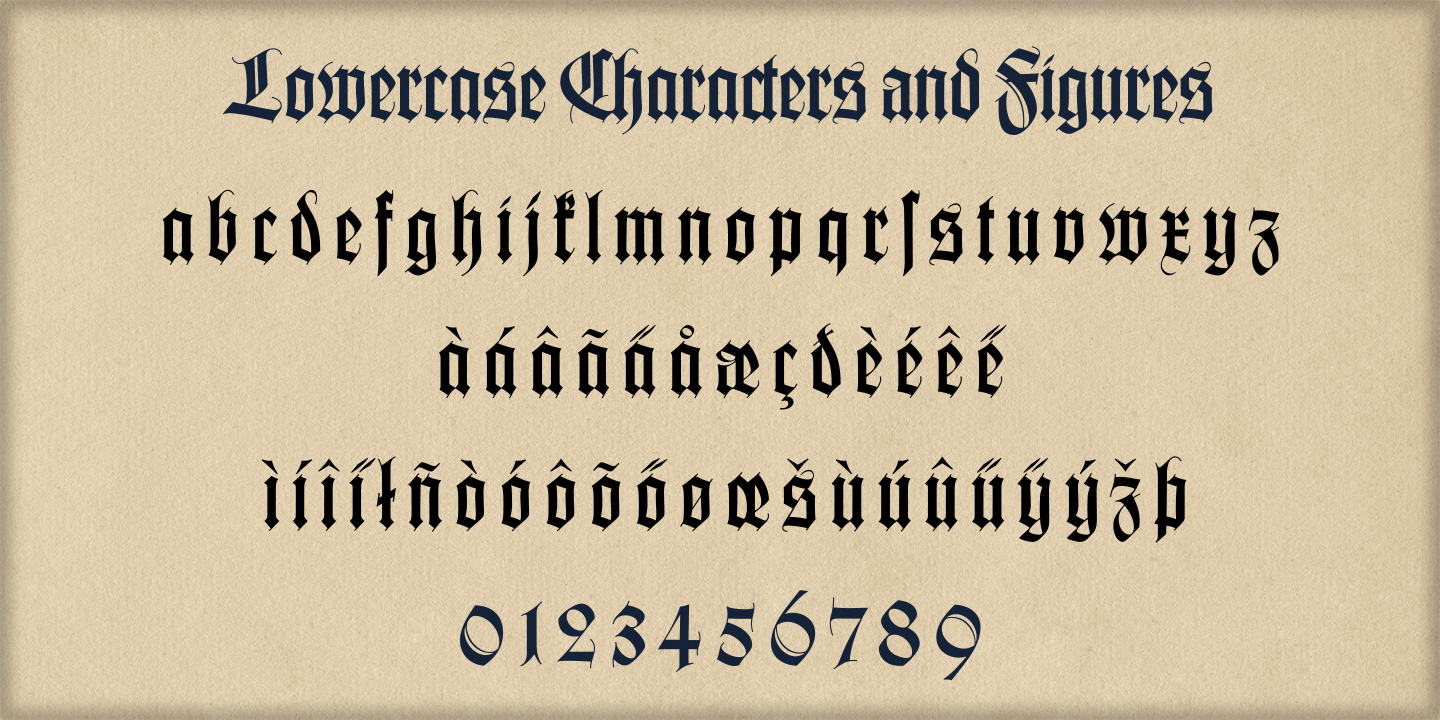
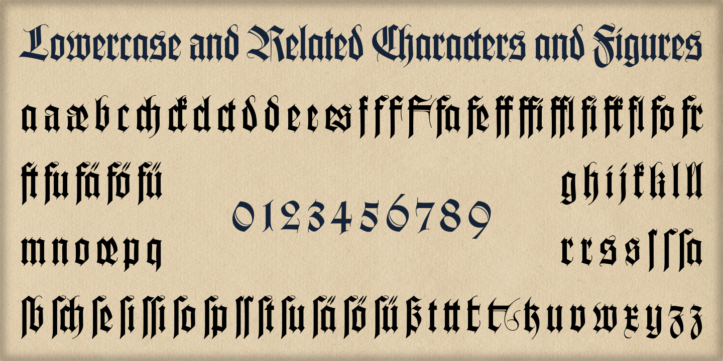
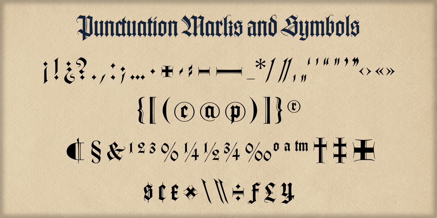
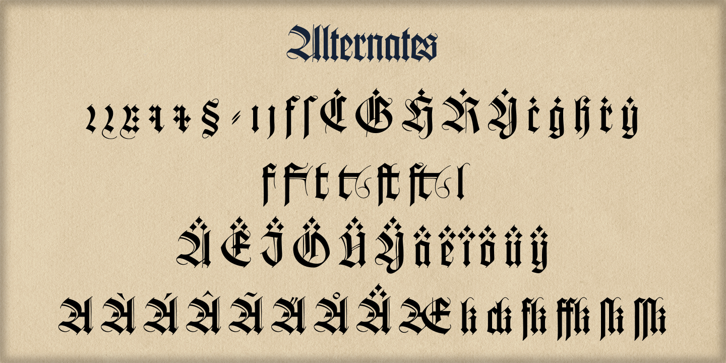
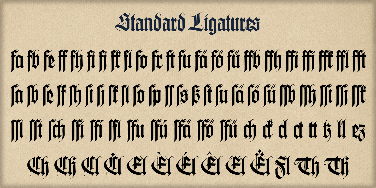
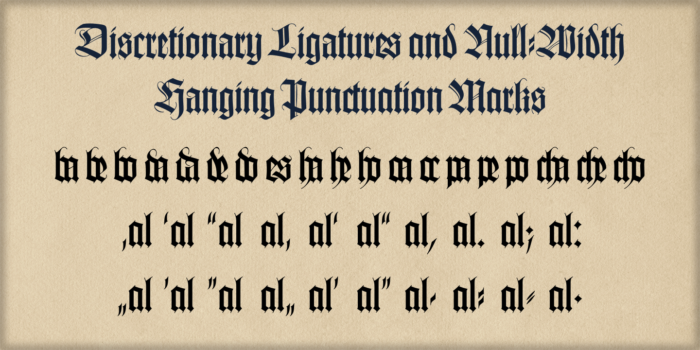
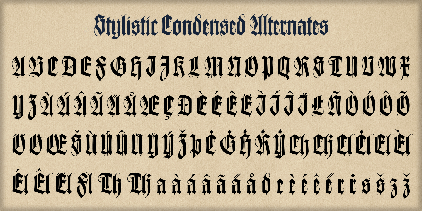
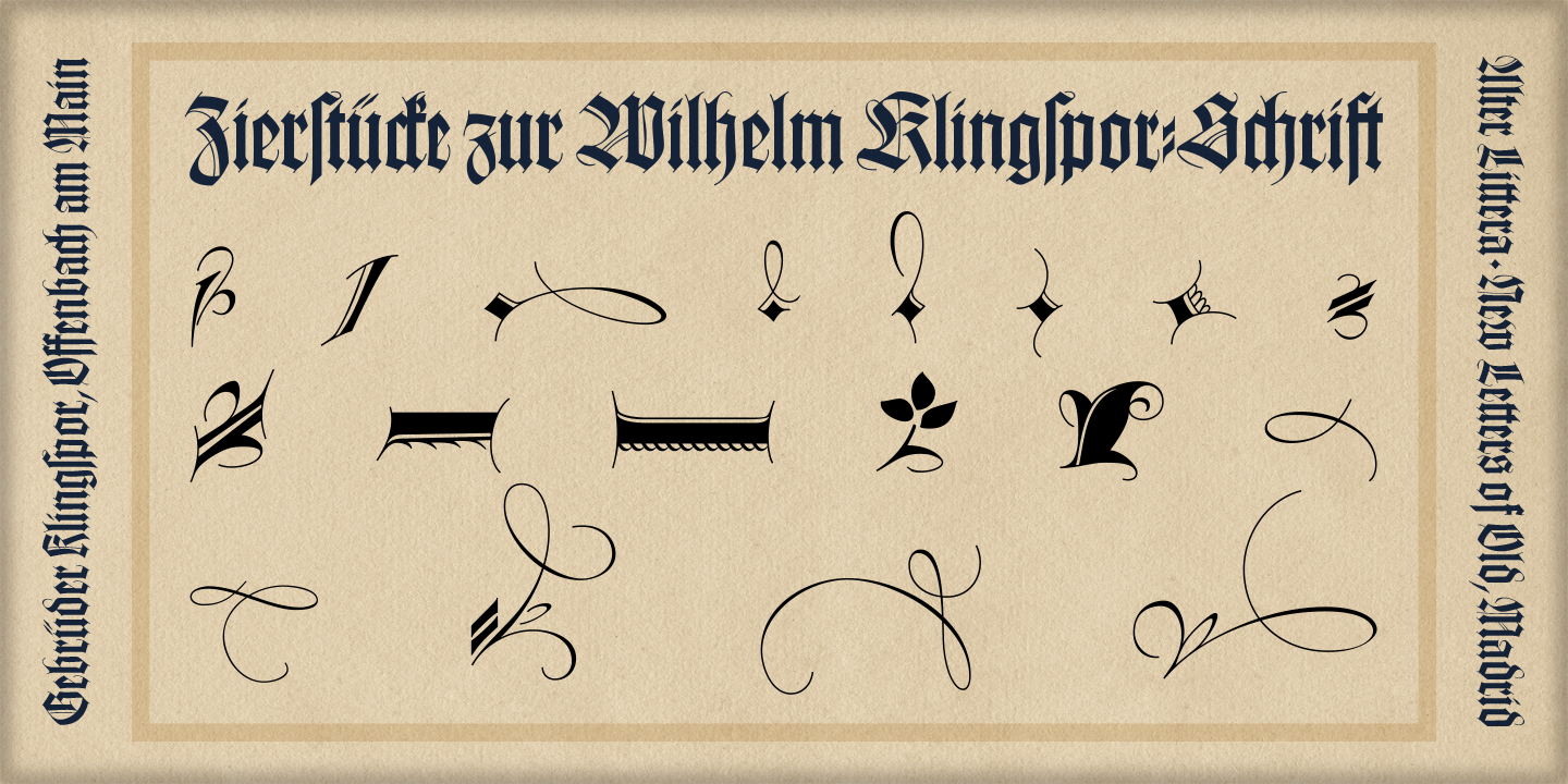
A comprehensive and faithful rendition of one of the finest metal typefaces of the 20th century. Rudolf Koch designed Wilhelm Klingspor Schrift (initially conceived as "Missal Schrift", and later referred to also as "Wilhelm Klingspor Gotisch") between 1919 and 1925 for the Gebr. Klingspor Type Foundry in Offenbach am Main. It is an impressive textura typeface, being sharp, elegant, spiky, sensitive and noble at the same time. Some of its most notable features have to do with the delicate decorations, the thin but subtly swelling lines that parallel or bridge strokes in the capitals, the hairline endings that terminate each stroke in both the capitals and the lowercase letters, the subtle joining of hairlines to thicker strokes, and the tension of some of the transitional curves. Koch's original design included two sets of capitals (normal and condensed); alternates for a, d, e, r, s and z, plus long s; short and long flourished finial forms for f and t; thirty-five ligatures; and eighteen decorative pieces (Zierstücke). All of these features, plus several additional ones for modern use (including the usual standard characters for typesetting in modern Western languages, additional alternates and ligatures, plus carefully coded Opentype features), have been thoroughly implemented to the highest and most lively level of detail in the present font, in the hope that the past greatness of Wilhelm Klingspor Schrift will finally step into the modern OpenType realm.
The main sources used during the font design process were several pages from a specimen book issued by the Gebr. Klingspor Type Foundry in 1927 (some of which are re-created below using the Oldtype "Wilhelm Klingspor Schrift" Font). Other sources were as follows: Bain, P., and Shaw, P. (Eds.) (1998), Blackletter: Type and National Identity, New York: Princeton Architectural Press (p. 43); Hendlmeier, W. (1994), Kunstwerke der Schrift, Hannover: Bund für Deutsche Schrift und Sprache (pp. 56-7); Kapr, A. (1983), Schriftkunst, Dresden: VEB Verlag der Kunst (p. 453); Kapr, A. (1993), Fraktur - Form und Geschichte der gebrochenen Schriften, Mainz: Verlag Hermann Schmidt (pp. 124-5); and Klingspor, K. (1949), Über Schönheit von Schrift und Druck, Frankfurt am Main: Georg Kurt Schauer (pp. 136-7). Some public and private comments by renowned designer and design historian Paul Shaw have also influenced both the design and the description of the present font.

|

|

|

|

|

|
Selected high-resolution font sheets available for purchase at the Digital Press
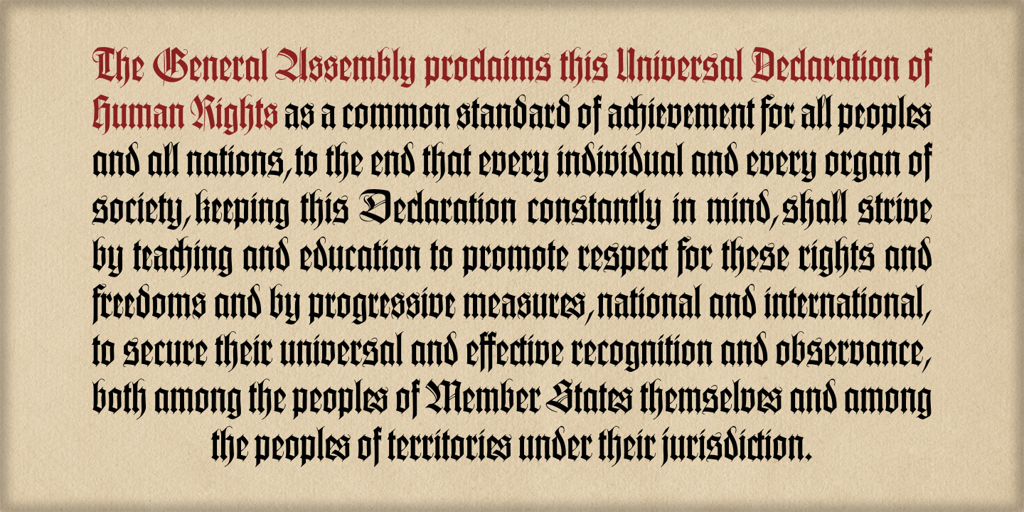
In the fourth and sixth sample images above, drop caps come from the Oldtype "Gótico Cervantes" Font (under development); header caps come from the Initials "Gothic A" Font (under development).
____________